Colorful men’s fashion works best when you follow one simple rule: one bold color per outfit, balanced by neutrals. Start with a single colored piece, use the color wheel to pick partners, and choose shades that suit your skin tone and contrast level.
Last updated: October 2026 · How we researched this: we based the combinations on standard color theory (complementary, analogous and triadic schemes, checked with Adobe’s free color wheel tool) and compared advice from widely read menswear style guides.
Key takeaways
- Use the 60-30-10 rule: 60% neutral, 30% secondary color, 10% accent.
- Start color far from your face (socks, sneakers, chinos) if you are nervous about it.
- Muted shades (olive, rust, burgundy, navy) are the easiest way into color.
- Match color intensity to your contrast: high-contrast men can wear brighter colors.
- Fit still matters more than color. A bright shirt that fits badly looks worse than a gray one that fits well.
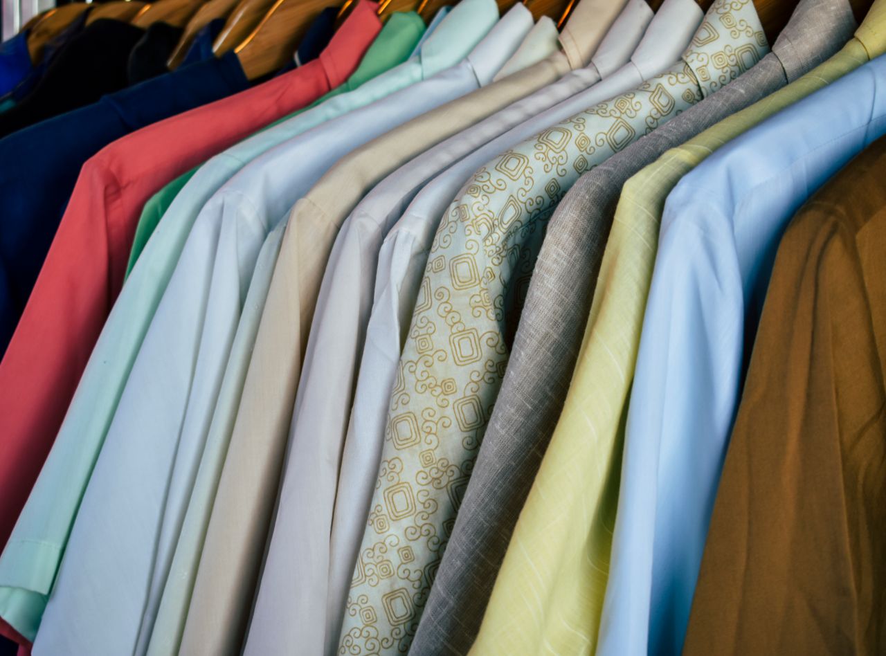
How to wear colorful men’s fashion without looking loud
Most men own navy, gray, black, white and denim. Those neutrals are your base, and they make color easier, not harder. The goal is to let one or two colored items stand out against them.
- Pick one hero piece: a green overshirt, a rust knit, or a pink oxford shirt.
- Build around it with neutrals: navy trousers, white sneakers, gray jacket.
- Echo the color once, quietly: a pocket square, socks or a cap in a related shade.
- Check texture: bright color in matte cotton or wool looks richer than in shiny fabric.
Color wheel combinations for men’s outfits
The color wheel is the fastest way to pair colors with confidence. You can try any combination on Adobe Color’s free color wheel before you buy.
| Scheme | What it means | Outfit example | Difficulty |
|---|---|---|---|
| Monochrome | Shades of one color | Light blue shirt, navy blazer, mid-blue chinos | Easy |
| Analogous | Neighbors on the wheel | Olive trousers, mustard knit, brown boots | Easy |
| Complementary | Opposites on the wheel | Navy suit with a rust or burnt-orange tie | Medium |
| Split-complementary | One color plus two neighbors of its opposite | Blue shirt, orange-red and yellow-orange accents | Medium |
| Triadic | Three evenly spaced colors | Muted red, navy and mustard in a casual look | Hard |
A tip most guides skip: complementary colors look best when one is muted or dark. Navy with burnt orange is classic. Bright blue with bright orange looks like a sports kit.
Best colors for your skin tone
Two things matter: your undertone (warm, cool or neutral) and your contrast (the difference between your skin, hair and eyes). Check your wrist veins in daylight: greenish suggests warm, bluish suggests cool, a mix suggests neutral.
| Skin tone / contrast | Colors that usually flatter | Use with care |
|---|---|---|
| Fair, cool undertone | Navy, burgundy, emerald, soft pink, cool gray | Bright orange, mustard near the face |
| Fair, warm undertone | Olive, camel, coral, warm teal | Pale yellow, washed-out pastels |
| Medium or olive | Rust, forest green, cobalt, burgundy, terracotta | Khaki or beige close to your skin color |
| Deep, any undertone | Bright white, cobalt, emerald, mustard, fuchsia, orange | Dark brown or black against the face with no contrast |
| Low contrast (similar hair and skin) | Soft, muted tones in one family | Stark black and white combos |
| High contrast (dark hair, light skin) | Saturated colors, strong pairings | All-pastel outfits |
These are starting points, not rules. Hold the item under your chin in daylight. If your face looks brighter, keep it. If you look tired or flushed, wear that color lower on the body.
Colorful pieces to start with (easiest to hardest)
- Level 1: patterned socks, a colored watch strap, a knit beanie.
- Level 2: olive or burgundy chinos, a rust or forest green sweater.
- Level 3: a pink or lilac shirt, colored sneakers.
- Level 4: a colored overshirt or chore jacket.
- Level 5: a colored suit or tonal head-to-toe outfit.
Common mistakes with color (and fixes)
- Too many bright colors at once. Fix: keep to one or two, everything else neutral.
- Matching too exactly, like a tie and pocket square cut from the same fabric. Fix: pick related shades instead.
- Ignoring the season. Fix: earthy and deep tones in autumn and winter, lighter and brighter in spring and summer.
- Bright color at work in a conservative office. Fix: bring color in through the shirt or tie, not the suit.
Who should keep it minimal: men in formal dress-code jobs, or anyone building a first capsule wardrobe on a tight budget. Buy neutrals first, then add one colored piece per season.
Thinking of turning your style into a small clothing brand? See our guide to setting up a Shopify store and our Shopify vs Wix vs WordPress comparison.
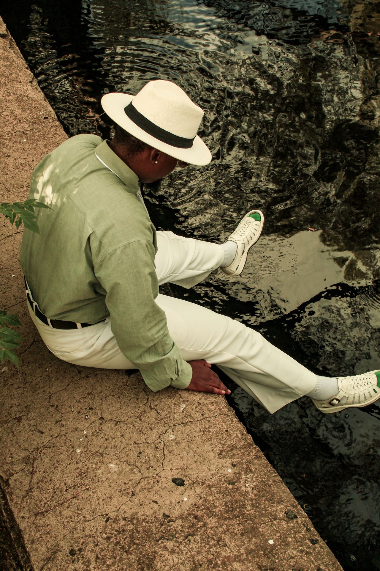
Related guides
- How to start an online clothing store in 2026
- How to create an online store in 9 practical steps
- Best ecommerce website builder for a small fashion brand
FAQ: colorful men’s fashion
What colors should a man wear to look good?
Navy, gray, white, olive and burgundy flatter most men and mix easily. From there, add colors that suit your undertone, such as cool blues and emerald for cool skin or rust and olive for warm skin.
How many colors should a man wear in one outfit?
Three is a safe maximum for most outfits, not counting neutrals like white, gray or denim. The 60-30-10 rule keeps it balanced: one main color, one secondary and one small accent.
Can men wear pink?
Yes. Pink has been part of classic menswear for a long time, especially in oxford shirts. Soft pink works well with navy and gray, and it suits most skin tones.
What color goes with navy for men?
Almost everything. White, light blue, gray, tan, burgundy, olive and rust all pair well with navy. Burnt orange is the bolder complementary choice.
Conclusion
Colorful men’s fashion is not about wearing every shade at once. Start with one piece, use the color wheel to choose its partners, and pick tones that suit your skin and contrast. Build up slowly and color soon feels natural.